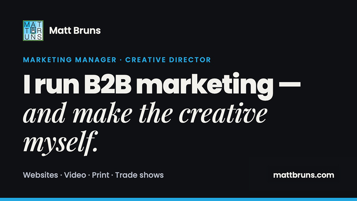
My old portfolio was a designer’s portfolio. It had a grid of thumbnails, a lot of logos, and plenty of the work I did years ago. It didn’t say much about what I’ve been doing for the last few years, which is running marketing for a B2B manufacturer and making most of the creative myself.
So I rebuilt it. The new mattbruns.com is aimed at one reader: someone hiring a Marketing Manager or Creative Director. Client and agency work now lives at Brunshouse, so the personal site can stay focused.
Start with the headline
The homepage now opens with one sentence: I run B2B marketing, and make the creative myself. Everything else on the site exists to back that up.
Below it is a 1:25 showreel that autoplays, muted, in the hero. If someone only gives the site ten seconds, they still see 3D product renders, video, print and trade show work moving past.
One case study instead of twenty thumbnails
The biggest change is the Hamar Laser case study. Hamar is a laser alignment manufacturer, and I’ve spent the last several years as its marketing department. Before, that work was spread across a handful of separate project pages: a brochure here, a video there. Spread out like that, it looked like a pile of freelance jobs.
Now it’s one page: Bringing Hamar Laser’s marketing into 2026, one channel at a time. It’s organized by channel:
- Website. The X-Series product site.
- Video. Product videos and 3D animation, including the L-703SP series.
- Print. Brochures, datasheets and a flatness flyer, shown as a rendered mockup instead of a flat PDF.
- Social. Four posts a week across two brands for almost two years, plus the “From the Field” interview series.
- Marketing operations. HubSpot as the CRM, email, paid search, traffic reporting and contact lists. This is the part a hiring manager can’t see in a thumbnail grid, so it gets its own section.
- Events. Trade show booth graphics and support.
Every image opens in a lightbox, and the videos play right on the page. The old project URLs redirect to the matching section, so nothing that was already linked breaks.
The other projects got a real template
The remaining projects, like 3D call center mockups, instruction manuals and social shorts, now share one project template. Each has a short write-up, a gallery and a “Next project” card at the bottom. I also went through every page and made sure the copy matched the images. That sounds obvious, but my old site failed that test in a couple of places.
How it was built
I designed the layout as a prototype first and then rebuilt it in WordPress with Elementor. I didn’t hand-drag every widget. Each page was generated as an importable Elementor template, so a page is effectively a small script I can change and re-run. When I rewrote the social section or swapped a headline, I regenerated the template and re-imported it.
The small stuff
These are the details nobody notices unless they’re missing:
- A contact form opens in a popup, with my email address still visible for people who’d rather just write. Getting form mail to actually arrive in my inbox, and not in junk, meant sending it through proper SMTP and adding a DMARC record. That was an afternoon well spent.
- SEO basics: real page titles and descriptions, a clean sitemap, a share image for LinkedIn, and redirects for every retired page.
- A footer year that updates itself, so the site never looks abandoned in January.
- A 404 page with a 3D render of the L-740 laser rotating full screen behind the message. If you’re going to land on a dead link, it might as well be a good-looking one.
What’s next
I’m going to watch where traffic actually goes and keep tightening. A portfolio is never really done. It just gets less out of date.
If you’re hiring for a marketing, creative or brand role, or you just want to see the work, it’s all at mattbruns.com.